I likey
aj's pics thread (currently: REVIVED)
Moderator: Moderators
-
Ironworks

- Templar Inner Circle
- Posts: 3314
- Joined: Wed Mar 31, 2010 11:23 pm
- Location: Californication
Re: aj's pics thread (currently: REVIVED)
Jeez, you have got some Seriously amazing Photos here!
I likey
I likey


Re: aj's pics thread (currently: REVIVED)
Thanks leo and gumby.
Finally got around to uploading more photos. Or, actually, photo, singular. =\
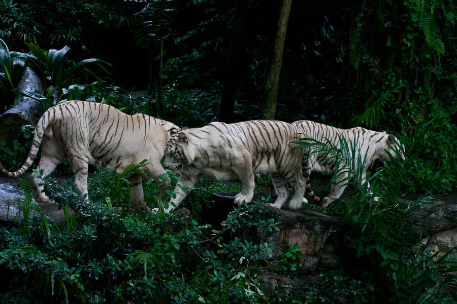
^ I couldn't come up with anything good, so I just dubbed it "The Train". The tigers were pacing before feeding time and happened to go like this.
Finally got around to uploading more photos. Or, actually, photo, singular. =\
^ I couldn't come up with anything good, so I just dubbed it "The Train". The tigers were pacing before feeding time and happened to go like this.
y̸̶o͏͏ų̕ sh̡o̸̵u̶̕l̴d̵̡n̵͠'̵́͠t͜͢ ̀͜͝h̶̡àv̸e͡ ̛d̷̨͡o͏̀ne ̶͠͡t҉́h̕a̧͞t̨҉́.̵̧͞.͠͞.͟avwolf wrote:"No dating dog-girls, young man, your father is terribly allergic!"
Re: aj's pics thread (currently: REVIVED)
New pics!
y̸̶o͏͏ų̕ sh̡o̸̵u̶̕l̴d̵̡n̵͠'̵́͠t͜͢ ̀͜͝h̶̡àv̸e͡ ̛d̷̨͡o͏̀ne ̶͠͡t҉́h̕a̧͞t̨҉́.̵̧͞.͠͞.͟avwolf wrote:"No dating dog-girls, young man, your father is terribly allergic!"
-
GreencoyotE
- Templar GrandMaster
- Posts: 753
- Joined: Sun Apr 27, 2008 6:54 pm
- Location: Your imagination...
- Contact:
Re: aj's pics thread (currently: REVIVED)
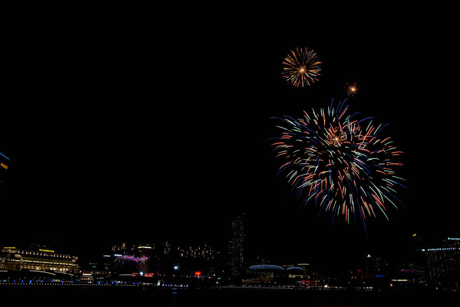
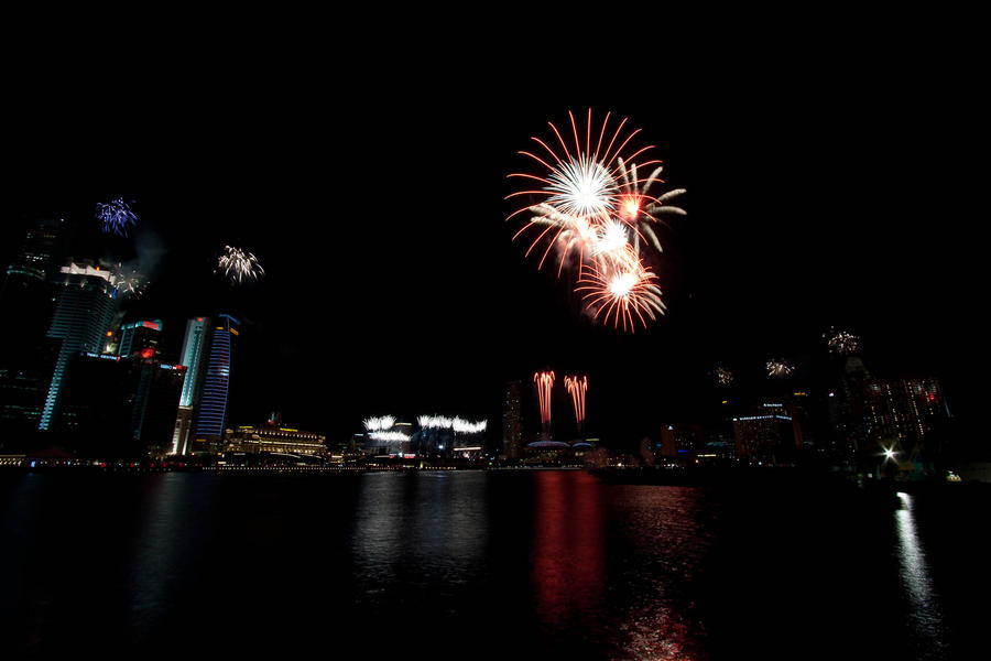
Colours! I love those fireworks shots, especially the one where you can see the water. I've always loved the way bright colours contrast with the dark night sky. They're also very crisp.
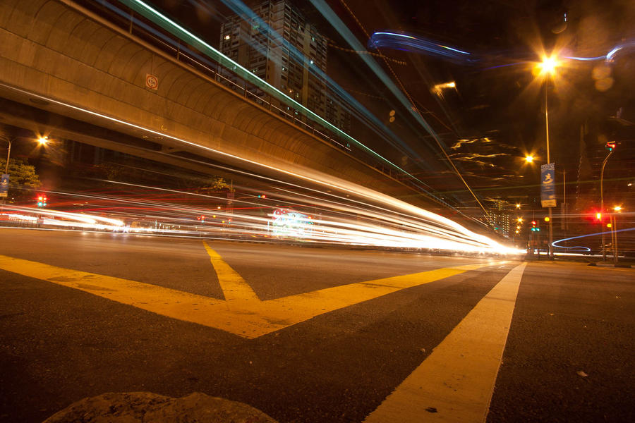
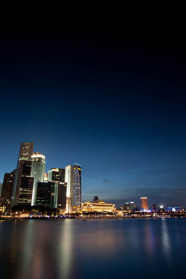
The street shots are also very nice, especially the one sans the ghost cars.
Nice shots, aj. X3
The street shots are also very nice, especially the one sans the ghost cars.
Nice shots, aj. X3
-
Ironworks
- Templar Inner Circle
- Posts: 3314
- Joined: Wed Mar 31, 2010 11:23 pm
- Location: Californication
Re: aj's pics thread (currently: REVIVED)
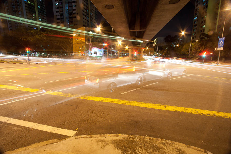
Really like the first open shutter car shot thingy
It eminates awesome.
It eminates awesome.
-
avwolf

- Templar Inner Circle
- Posts: 7006
- Joined: Wed Jan 17, 2007 5:33 pm
- Location: Nebraska, USA
- Contact:
Re: aj's pics thread (currently: REVIVED)
Those are some really gorgeous fireworks, aj. Apparently, they keep the best ones over there.
Re: aj's pics thread (currently: REVIVED)
GreencoyotE wrote:Colours! I love those fireworks shots, especially the one where you can see the water. I've always loved the way bright colours contrast with the dark night sky. They're also very crisp.
The street shots are also very nice, especially the one sans the ghost cars.
Nice shots, aj. X3
GumbyDarnit wrote:Really like the first open shutter car shot thingy
It eminates awesome.
Thanks all.avwolf wrote:Those are some really gorgeous fireworks, aj. Apparently, they keep the best ones over there.
Here's a preview:
y̸̶o͏͏ų̕ sh̡o̸̵u̶̕l̴d̵̡n̵͠'̵́͠t͜͢ ̀͜͝h̶̡àv̸e͡ ̛d̷̨͡o͏̀ne ̶͠͡t҉́h̕a̧͞t̨҉́.̵̧͞.͠͞.͟avwolf wrote:"No dating dog-girls, young man, your father is terribly allergic!"
Re: aj's pics thread (currently: REVIVED)
It's been a long time. How have you been?
(Cross-posted to my dA account)
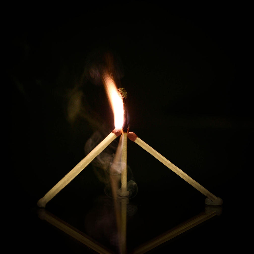
Today I thought I might as well talk about how I did this photo, since I reworked it from the original.
So here's my thought process as I worked on this. (Be warned, it's image heavy.)
First off, it's a photo of a pyramid of matches, with the flame on the center match igniting the second match. I particularly liked this one because you can see the streaks of something as the head ignites. I have a bunch of others with a cool wispy effect, but this one is in my desktop background rotation now.
Now, the basic photo as it came out of my camera looks considerably cleaner, but that's because it's a lot larger, and the shrinking algorithm isn't perfect, so a lot of the fine details (like the smoke) got wiped out:

To me, the cleanliness is helped by the complete black at the top - but that was gotten rid of, since I felt that there was too much black, making the photo unbalanced.
Problem is, when I remove enough of the black space that I thought the photo was balanced, the focal point of the photo isn't really 'there'.

At first glance, you can't really tell where you're supposed to look. Ok, fine, you're attracted to the flame in the upper part of the image. But the center of the image doesn't have anything, and the flame reflection at the bottom is of obvious interest. So my eye starts drifting towards the bottom of the image.
But I wanted to keep your eye on the flame, and particularly the flying sparks! Ok, crop out the bottom flame, and rebalance the photo.

Ok, now you're focused on the flame. But... now my eye wants to find out what's on the other end of the sticks since there are lines leading out of the image!
I shifted the crop up and down for a while, trying to find a good balance of sticks leading out and the overall image.

Getting rid of the reflection completely just looked off. Don't know why, it just did. (Could be that where the sticks just ended, my mind was subconsciously wondering and looking for a platform to support the sticks.)
It seemed obvious then to keep part of the sticks in the image, but use vignetting and a graduation filter (in Lightroom) to make the sticks slowly fade to black. Except that looked strange, so I ended up reducing the effect so that it just seemed to fade out.
The last steps were to make the sticks less intense. Compare the final image to the starting - To me the sticks stand out a lot more, mainly because of the intensity of the colour. So, I knocked down the saturation of the yellow channel. (Which is why the flame in the final looks a bit redder. At least, to me it does.)
Final steps were to do a bit of sharpening, increase the contrast, and use the center stick as a reference to straighten the image.
===
And I did say it was in my desktop background rotation. But not the version posted above.

Because of the aspect ratio of my monitor, I had to vary it a bit. I did an even tighter crop on the flame. Looking at it in the small version, it could do with a bit of shifting, but on my monitor, in person, it looks fine.
(Cross-posted to my dA account)
So here's my thought process as I worked on this. (Be warned, it's image heavy.)
First off, it's a photo of a pyramid of matches, with the flame on the center match igniting the second match. I particularly liked this one because you can see the streaks of something as the head ignites. I have a bunch of others with a cool wispy effect, but this one is in my desktop background rotation now.
Now, the basic photo as it came out of my camera looks considerably cleaner, but that's because it's a lot larger, and the shrinking algorithm isn't perfect, so a lot of the fine details (like the smoke) got wiped out:
To me, the cleanliness is helped by the complete black at the top - but that was gotten rid of, since I felt that there was too much black, making the photo unbalanced.
Problem is, when I remove enough of the black space that I thought the photo was balanced, the focal point of the photo isn't really 'there'.
At first glance, you can't really tell where you're supposed to look. Ok, fine, you're attracted to the flame in the upper part of the image. But the center of the image doesn't have anything, and the flame reflection at the bottom is of obvious interest. So my eye starts drifting towards the bottom of the image.
But I wanted to keep your eye on the flame, and particularly the flying sparks! Ok, crop out the bottom flame, and rebalance the photo.
Ok, now you're focused on the flame. But... now my eye wants to find out what's on the other end of the sticks since there are lines leading out of the image!
I shifted the crop up and down for a while, trying to find a good balance of sticks leading out and the overall image.
Getting rid of the reflection completely just looked off. Don't know why, it just did. (Could be that where the sticks just ended, my mind was subconsciously wondering and looking for a platform to support the sticks.)
It seemed obvious then to keep part of the sticks in the image, but use vignetting and a graduation filter (in Lightroom) to make the sticks slowly fade to black. Except that looked strange, so I ended up reducing the effect so that it just seemed to fade out.
The last steps were to make the sticks less intense. Compare the final image to the starting - To me the sticks stand out a lot more, mainly because of the intensity of the colour. So, I knocked down the saturation of the yellow channel. (Which is why the flame in the final looks a bit redder. At least, to me it does.)
Final steps were to do a bit of sharpening, increase the contrast, and use the center stick as a reference to straighten the image.
===
And I did say it was in my desktop background rotation. But not the version posted above.
Because of the aspect ratio of my monitor, I had to vary it a bit. I did an even tighter crop on the flame. Looking at it in the small version, it could do with a bit of shifting, but on my monitor, in person, it looks fine.
y̸̶o͏͏ų̕ sh̡o̸̵u̶̕l̴d̵̡n̵͠'̵́͠t͜͢ ̀͜͝h̶̡àv̸e͡ ̛d̷̨͡o͏̀ne ̶͠͡t҉́h̕a̧͞t̨҉́.̵̧͞.͠͞.͟avwolf wrote:"No dating dog-girls, young man, your father is terribly allergic!"