My.. um... art. update: 8/5 Possible Redesign? <WIP>
Moderator: Moderators
-
AlfaWskyDlta

- Templar GrandMaster
- Posts: 760
- Joined: Sun Aug 21, 2011 1:21 am
- Location: BOREthern California
Re: My.. um... art. (update 9/5)
wow, that helps... thanks!
Fuzzle wrote:Alfaw...Alfydiys...A...Hard to remember name guy
-
redundant_redundant

- Grand Templar
- Posts: 1825
- Joined: Mon Apr 18, 2011 12:54 pm
- Location: canterlot. I come to save thee luna :D
Re: My.. um... art. (update 9/5)
the human body is the perfect measurement systemAlfaWskyDlta wrote:wow, that helps... thanks!
Twokinds Revolution. an epic story of the still continuing war between basitons and humans, with kiedran caught in the middle

Chocolate wrote:Because its TASTY
- Chocolate
-
Moviedude18.0
- Templar GrandMaster
- Posts: 673
- Joined: Sat Sep 26, 2009 6:16 am
- Location: Noneyer. :P
Re: My.. um... art. (update 9/5)
Allow me to correct some of redundant's helpful criticism.

Wrong. None of these women have arms (the anatomically correct term for "shoulder to elbow"; forearm is the term for elbow to hand) as long as their torsos (a torso is the body minus the head and limbs. That leaves the chest, waist, and hips. Your rule is sometimes true from shoulder to top of the hip, but NOT for the torso).redundant_redundant wrote:...a torso should be as long as the shoulder to the elbow...
True.redundant_redundant wrote:the forearm should be the same size.
Wrong. Thigh to knee =/= the arm (referring to technical meaning of term).redundant_redundant wrote:add a quarter of size to both peices for the legs, so the thigh to the
knee should be a the size of the shoulder to elbow, plus one quarter of
that length...
Ummm...what? I've never heard of using head heights to measure the shoulders. I have heard that the shoulders equal two and a half to three head widths wide, and a human body is, on average, about six head heights tall (sometimes 7 if the figure is stylized or long-legged). In an idealized human figure, the length from the top of head to the middle (emphesis on that part-it's very important!) of the hips equals the length from the middle of the hips to the feet. (This can vary slightly, as some people have longer legs than others). Something I've observed is that for a lot of people, the length of a person's legs (hip to ankle) roughly equals double the length from their shoulders to the top of their hip.redundant_redundant wrote:shoulder length should be equal to two head-hights sideways,
and heads should proportional to the body.
Yes it is, assuming you have the measurements right.redundant_redundant wrote:the human body is the perfect measurement systemAlfaWskyDlta wrote:wow, that helps... thanks!


-
AlfaWskyDlta
- Templar GrandMaster
- Posts: 760
- Joined: Sun Aug 21, 2011 1:21 am
- Location: BOREthern California
Re: My.. um... art. (update 9/5)
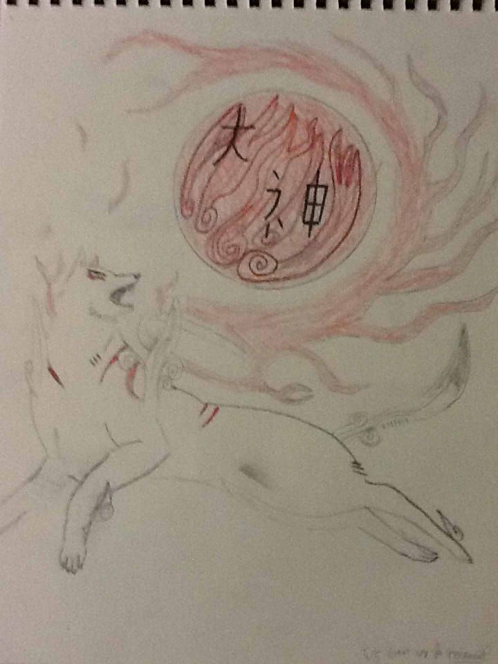
So, I got kind of board today and decided to color one of my okami sketches I had laying around. Looking at it now, I think that it might be one of my favorite things I’ve done so far… probably just because there’s nothing that I can see that’s majorly wrong with it. (although I’m sure someone will prove me wrong  ) Using the watercolor brush for the first time was interesting. I think I’m going try to inject a little okami-ish watercolor style into some of my stuff in the future.
*slaps self in the face*
Back to the point, here is Oki from Okami…

For those of you who don’t speak Japanese: the characters in the top right are Oki’s name, and the ones at the bottom left are mine (I couldn’t just sign it normally, I had to go with the theme… )
)
[EDIT]: Someday I’ll do that longboarding one, when I have more time…
*slaps self in the face*
Back to the point, here is Oki from Okami…
For those of you who don’t speak Japanese: the characters in the top right are Oki’s name, and the ones at the bottom left are mine (I couldn’t just sign it normally, I had to go with the theme…
[EDIT]: Someday I’ll do that longboarding one, when I have more time…
Fuzzle wrote:Alfaw...Alfydiys...A...Hard to remember name guy
-
AlfaWskyDlta
- Templar GrandMaster
- Posts: 760
- Joined: Sun Aug 21, 2011 1:21 am
- Location: BOREthern California
Re: My.. um... art. (update 9/11) (NOW WITH OKAMI!)
So, I’ve been pretty frustrated with drawing lately. Mostly because of how bad at it I am. I’m honestly not sure how interested I am in continuing with it, and how my lack of activity on this board in the last month and a half may suggest, I haven’t really been spending that much time drawing. Today, though I made a conscious effort to draw, using what very little time I had that wasn’t devoted to homework to squeeze out these Okami sketches: (sorry about bad quality… )


I honestly don’t know how active I’m going to be on this board in the future, if at all. I’m just going to try to draw more in the next few weeks and if I like what I see I’ll post it.
I honestly don’t know how active I’m going to be on this board in the future, if at all. I’m just going to try to draw more in the next few weeks and if I like what I see I’ll post it.
Fuzzle wrote:Alfaw...Alfydiys...A...Hard to remember name guy
-
Waka The Fox

- Master
- Posts: 229
- Joined: Fri Jun 24, 2011 1:11 pm
- Location: Just wandering around
Re: My.. um... art. (update 10/24)
There quite neat, I like this. 
Waka The Fox at your service, By fire and blade will my foes die, Face me and to Sovngarde you shall go.
-
KyeRaor

- Grand Templar
- Posts: 1161
- Joined: Wed Oct 21, 2009 4:04 am
- Location: Super Awesome Albertan Canada
Re: My.. um... art. (update 10/24)
Something I've noticed (this is just from what I've observed) since the first post of this thread is that your confidence has gone lower and lower. Either that, or your enjoyment in drawing is on the decline. Getting better at drawing is difficult to do, since there's no set routine or steps to getting better.
While most of the critiques have been helpful, I get the feeling they're also dampening your motivation for drawing. I'm thinking that maybe you're taking the critiques more negatively than you should. I only say that because I was that way too. Still am that way, although not as much now that I'm perceiving critiques in a far better way. Before when I read someone's critique my reactions were "I'm doing this all wrong, I'll never get better, WHY CAN'T I DO THIS RIGHT?". Once I understood critiques weren't just long paragraphs telling me I was terrible, I saw them as "Okay, so that's what I can do for next time".
My advice? For now, take some time and just draw for yourself. I mean draw some pictures without uploading them to the forums, draw to impress yourself, and build some confidence back up. Make yourself say, "Hey that's pretty good". Drawing is something you do for yourself, because you enjoy it. There's a lot of help on the internet, take a picture of someone off of google images and practice proportions. Start with simple standing poses, and as time goes on move to more complicated ones. Start practicing Skeleton figure sketches, getting the proportions right first.
Just. Keep. At. It! Can't stress that enough.

-
AlfaWskyDlta
- Templar GrandMaster
- Posts: 760
- Joined: Sun Aug 21, 2011 1:21 am
- Location: BOREthern California
Re: My.. um... art. (update 10/24)
Just an update since I haven’t posted on here for a while…
I’ve kind of been taking Kye’s advice by doing some more drawing on my own, without posting. Most of it has been little 10-15 min pencil sketches of random things. (pretty uninteresting )
Through this process, however, I’ve found out that I’m much more confident sketching/beginning my drawings in pencil than in SAI. So, I guess that’s a good thing to know. I’ve also been trying to be less hard on myself, but it’s pretty difficult considering I’m that way about pretty much everything.
While my busy schedule is keeping me from embarking on any ambitious projects at home, I have done a couple of cool things in the art class I’m taking. I REALLY want to post one of them, a monochromatic painting of the Issun sketch I did (and posted) earlier, but my teacher won’t give it back to me yet.
I’ll try to get that up as soon as I can, and who knows? Maybe I’ll draw something cool over Thanksgiving break…
I’ve kind of been taking Kye’s advice by doing some more drawing on my own, without posting. Most of it has been little 10-15 min pencil sketches of random things. (pretty uninteresting
Through this process, however, I’ve found out that I’m much more confident sketching/beginning my drawings in pencil than in SAI. So, I guess that’s a good thing to know. I’ve also been trying to be less hard on myself, but it’s pretty difficult considering I’m that way about pretty much everything.
While my busy schedule is keeping me from embarking on any ambitious projects at home, I have done a couple of cool things in the art class I’m taking. I REALLY want to post one of them, a monochromatic painting of the Issun sketch I did (and posted) earlier, but my teacher won’t give it back to me yet.
I’ll try to get that up as soon as I can, and who knows? Maybe I’ll draw something cool over Thanksgiving break…
Fuzzle wrote:Alfaw...Alfydiys...A...Hard to remember name guy
-
AlfaWskyDlta
- Templar GrandMaster
- Posts: 760
- Joined: Sun Aug 21, 2011 1:21 am
- Location: BOREthern California
Re: My.. um... art. (update 10/24)
Hey, I'm back!
I finally got my monochromatic Issun painting back from my art teacher so, here it is!
I only used tints and shades of green, hence the monochromatic
The only thing that REALLY bothers me is that the hat isn't centered on his head.
let me know what you guys think!

I finally got my monochromatic Issun painting back from my art teacher so, here it is!
I only used tints and shades of green, hence the monochromatic
The only thing that REALLY bothers me is that the hat isn't centered on his head.
let me know what you guys think!
Fuzzle wrote:Alfaw...Alfydiys...A...Hard to remember name guy
-
AlfaWskyDlta
- Templar GrandMaster
- Posts: 760
- Joined: Sun Aug 21, 2011 1:21 am
- Location: BOREthern California
Re: My.. um... art. (update: Issun painting 11/30)
Wow, it's certainly been a while. 
Well we did some ceramic printing and I thought mine looked pretty cool so I figured I'd post it here.
The subject matter was inspired by the song "Meadowlarks" by one of my favorite bands, Fleet Foxes.

I have some prints in different colors, so if anyone wants to see some variations just ask.
Well we did some ceramic printing and I thought mine looked pretty cool so I figured I'd post it here.
The subject matter was inspired by the song "Meadowlarks" by one of my favorite bands, Fleet Foxes.
I have some prints in different colors, so if anyone wants to see some variations just ask.
Fuzzle wrote:Alfaw...Alfydiys...A...Hard to remember name guy
-
AlfaWskyDlta
- Templar GrandMaster
- Posts: 760
- Joined: Sun Aug 21, 2011 1:21 am
- Location: BOREthern California
Re: My.. um... art. (update: Need Critique/Advice)
The art class I started at the beginning of the semester is a lot more intense than the one I took last semester. intro to 2d art= joke We are doing a lot more drawing, which is giving me tons of practice.
Anyways, I decided to upload a few sketches I've done recently in hopes that I could get some advice on them. I'm having trouble drawing realistically and any help I could get would be greatly appreciated.
This is a rendition of the Okami cover that I did for last week's sketchbook assignment. I draw that game too much...
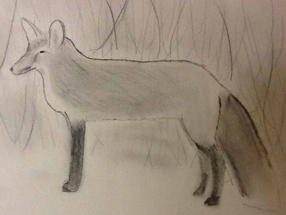
And here is a fox I drew for this week's assignment. For this one especially, any advice on how to make it more realistic looking would be much appreciated. lazy background=
More to come...
Anyways, I decided to upload a few sketches I've done recently in hopes that I could get some advice on them. I'm having trouble drawing realistically and any help I could get would be greatly appreciated.
This is a rendition of the Okami cover that I did for last week's sketchbook assignment. I draw that game too much...
And here is a fox I drew for this week's assignment. For this one especially, any advice on how to make it more realistic looking would be much appreciated. lazy background=
More to come...
Fuzzle wrote:Alfaw...Alfydiys...A...Hard to remember name guy

Re: My.. um... art. (update: Need Critique/Advice)
More realistic I can't necessarily help with, but if you want to make it a bit more appealing.. I'm by no means an animal-drawing expert, but I have a decent amount of experience drawing from life and photos. First off, before anything else - It's looking to me like you're having trouble getting details and precision due to either drawing too small or having an imprecise drawing implement, like an unsharpened pencil. This may sound silly, but it does make a difference! Being able to be in control of your art is a big deal. I suggest, if you're using pencil, that you get ahold of a mechanical pencil - these can still be used to shade if brandished lightly, but are also excellent for precision. Get a nice eraser too, like one of those white mars ones. Handle your drawing tools lightly and carefully; draw with precision and intent, rather than jamming down as if the art will fly off your page if you don't hold the lines there.AlfaWskyDlta wrote: And here is a fox I drew for this week's assignment. For this one especially, any advice on how to make it more realistic looking would be much appreciated.
Now, down to details!
After a quick look around google I found this image - fairly similar to yours, possibly even one you used as reference? Either way I'm going to do a quick line drawing from it.


I'm gonna try and explain my thought process here, since the image doesn't entirely speak for itself.
1. First up, the posing. If you're drawing this with traditional instead of digital you're going to want to draw VERY lightly, so you can easily erase it later. In general, don't be afraid to erase and redraw! fixing stuff is very important, especially when you're just starting out. You'll notice I've heavily exaggerated some things like the arch of the back and the curve of the legs. IMO, unless you are trying for a 1:1 copy, it's always better to gently exaggerate things so that they look and feel more organic to your brain. It's all too easy to get VERY stiff looking characters if you go too boxy or try to stick too close to the lines of the thing you're drawing. Think less about its outline and more about its mass. What shapes is it made of?
2. and 3. Here I've got the pose sketch very light, and now I'm sketching some basic proportions on top of this. Depending on who you are, and your understanding of proportion and anatomy, this may require more or less work. The third panel was what I got out of this immedaitely, but created the 2nd panel afterward to give you an idea of what sort of masses I was considering in my head as I did so. again, look for natural shapes that stand out within the thing you're drawing. In this case, I separated the fairly rectangular torso into two peices, a rib cage area and a hip / leg area, with a hanging belly between them, to help me keep the organic, curved feel. You'll almost never see straight lines in living beings, so try to avoid them, even if it kind of looks like there might be one. As I drew this, I adjusted the proportions from my previous sketch somewhat. Whenever you notice something looking off, take the time to fix it! Always be constantly comparing and analyzing between your subject and your drawing.
4. Here's the final, cleaned up result. Notice some tricks I'm using to make it look nicer:
* Alternating between solid and broken lines to indicate fluffier areas of the fur.
* Using hatching to give a bit of depth. This is a bit more advanced and can easily be done wrong, but is great for indicating changes of depth or color that may not necessarily be satisfied by a line.
* Using lines WITHIN the figure. It can be easy to get lost in the detail of the color changes and fur, but try to simplify and look for places like the upper part of the back leg, where there are visible changes you can indicate to make the fox feel more like a rounded object than a silhouette.
* Put extra time into the face! The face is where everyone looks first, always. Keep that in mind and put effort into making it look nice.
This is probably a lot to swallow at once, and most likely not all of it is going to be useful, but I hope at least some of it will help you out. Good luck, and keep practicing
-
AlfaWskyDlta
- Templar GrandMaster
- Posts: 760
- Joined: Sun Aug 21, 2011 1:21 am
- Location: BOREthern California
Re: My.. um... art. (update: Need Critique/Advice)
Thanks for the advice MOOMANiBE
Fuzzle wrote:Alfaw...Alfydiys...A...Hard to remember name guy
-
AlfaWskyDlta
- Templar GrandMaster
- Posts: 760
- Joined: Sun Aug 21, 2011 1:21 am
- Location: BOREthern California
Re: My.. um... art. update: 5/20
*stumbles into thread* Wow, it's been a long time since I've been around here... OH MY GOD WHAT THE HELL ARE THOSE THINGS ON THE FIRST TWO PAGES?!?!? KILL THEM WITH FIRE!
Anyways here is some new stuff...
One of our assignments in my art class was to do a surrealist self portrait, so I did one of me in a dream like pool. The turtle in the background has the head of one of my coaches.

Another assignment involved using letter stencils and printing ink, so I made this poster that's inspired by Au's RR vs D. It didn't take much skill to make, but I think it looks cool and goes with the song perfectly.

Anyways here is some new stuff...
One of our assignments in my art class was to do a surrealist self portrait, so I did one of me in a dream like pool. The turtle in the background has the head of one of my coaches.
Another assignment involved using letter stencils and printing ink, so I made this poster that's inspired by Au's RR vs D. It didn't take much skill to make, but I think it looks cool and goes with the song perfectly.
Fuzzle wrote:Alfaw...Alfydiys...A...Hard to remember name guy
-
AlfaWskyDlta
- Templar GrandMaster
- Posts: 760
- Joined: Sun Aug 21, 2011 1:21 am
- Location: BOREthern California
Re: My.. um... art. update: 6/24 New Start...
So It's been a while... like, over a year. I've been on hiatus from drawing for a while because of some other things I've had going on in my life. It's funny what joining the military can do to your free time. Anyways, I started up again about a month ago so I figured I'd share some of the stuff I've been doing.
I've been trying to get better at drawing cartoon animals, so I've been doing sketches from my favorite childhood movie, Balto. They turned out to be fun and fast to draw so I kind of drew more than I thought I would. Just for fun I put them in the order that I drew them because I thought the progression was interesting.
Ok... not too bad of a start...

Alright, getting better.

Kind of a step backwards

Alright, that's more like it.


I have some more non-Balto stuff but it's getting pretty late and I have work in the morning. I'll get it up some other time.
I've been trying to get better at drawing cartoon animals, so I've been doing sketches from my favorite childhood movie, Balto. They turned out to be fun and fast to draw so I kind of drew more than I thought I would.
Ok... not too bad of a start...
Alright, getting better.
Kind of a step backwards
Alright, that's more like it.
I have some more non-Balto stuff but it's getting pretty late and I have work in the morning. I'll get it up some other time.
Fuzzle wrote:Alfaw...Alfydiys...A...Hard to remember name guy