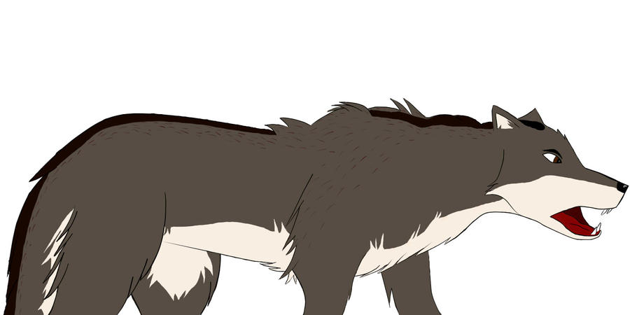
Good color scheme, and although I don't have much experience with wolf anatomy, there are a couple issues I can see in the picture.
Most notable of these issues would be the perspective of the head: while the mouth, teeth, and nose seem to be angled towards the viewer, the rest of the head appears to remain in a side-view. For reference, his head appears to be in a position similar to
this, while his mouth is more in the line of
this. The other side of the bridge and forehead should be more prevalant, assuming you intend to follow the mouth's current position. Make it 3D, yo!
Other minor issues can be seen, such as how the mouth's side in the background appears to have a convex shape, like a membrane connection, while the foreground side of the appears to simply meet at an angle. Having both be convex would make a bit of a lazy face, while making them both angled would make him seem a bit more fierce. Your choice! (reflect it in his expression too, if you do make a change. Eyes are the window to the soul, after all!)
The stripe along the back of the wolf also appears very dissonant with the rest of its fur, without having any of the frays or hairs to be expected in a fur-like texture, as well as ending very abruptly. Look at wolf heads to see what I mean for yourself. To fix this, however, would require texturing the fur, and I'm uncertain if you want to go to that length. Otherwise, I'd say try making it a bit more jagged, following the body's shape, rather than being a bold line going across the top of the wolf.
Hopefully this critique doesn't come off as rude, and if another artist gives you any recommendations, please follow them! I'm very amateur when it comes to art, and this is the extent of my knowledge right now.
I hope to see the finished product!


