Red Haze - Portrait of a lady - 15-11-10

Post all your artwork here!

Moderator: Moderators

Post Reply
Message
Author
User avatar
emmy
Violent. Hateful. Fluffy.
Posts: 4068
Joined: Fri Apr 10, 2009 2:34 pm
Location: Comfortably on two special pillows~

Red Haze - Portrait of a lady - 15-11-10

#1 Post by emmy »

Welcome to my very own arty-farty thread! Please look around and comment on what you see! I'm a perfectionist, so constructive criticism is always welcome.

materials i usually use:
- 0.5mm HB mechanical pencil from Stabilo with small eraser on top ...always sharp and precise, these things also last for more than a year with refills. an ordinary pencil won't last three months before it's totally used up by me
- occasionally a Steadler 2B ordinary pencil for shading
- one huge [censored] eraser of 8 cm (a bit more than 3 inch)
- 5mm grid paper from maths exercise book. (yes. i call it a maths exercise book because i usually take it to maths, but that pretty much says it all.)


eurg... my scanner hates pencil drawings it seems. I should go and buy some inking pens again, although i rarely ink sketches.

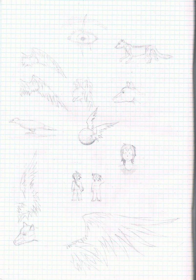
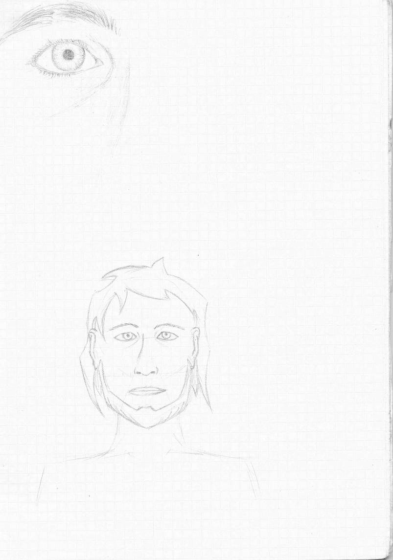
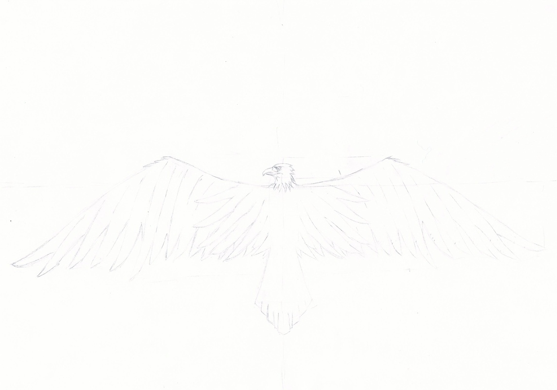
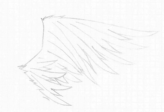
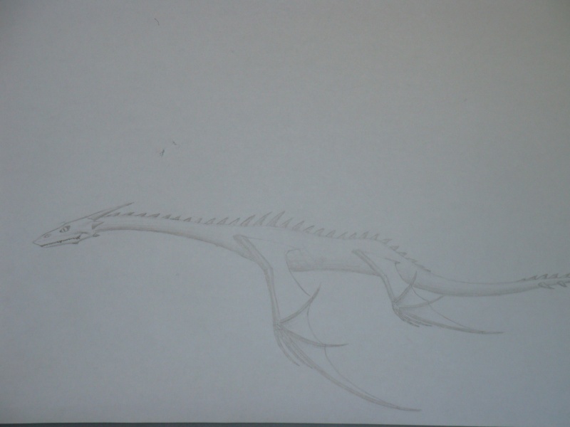
some various study sketches on wing designs, canine and anthro heads practice, also two chibi characters i felt like drawing during one hell of a boring math class. i really like how the bottom right wing came out.
page one
time: dunno? total 2 hours or so... these kind of doodles usually happen on random moments

materials
- 0.5mm HB pencil pen
- Steadler 2B pencil for the occasional shading
- eraser
- 5mm grid paper


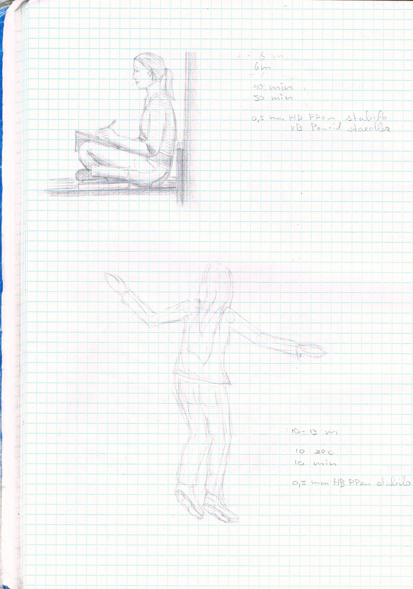
a sketch of a girl studying during an empty hour between lessons, shading overtly dramatized and one quick sketch of some girl i know who was just being very happy and hyper... wanted to practice proportions in dynamic poses together with my photographic memory.
page 2
1. studying girl
time: pose +- 40min, total drawing +- 50min
drawing distance: 6m (about 18-20 feet)
2. hyper girl
time: pose 10 seconds or less, total drawing 10 min
drawing distance: 10 to 13 m (30 to 40 feet)

materials
- 0.5mm HB pencil pen
- Steadler 2B pencil for the shading
- eraser
- 5mm grid paper


first one is a proportions study of a sitting/leaning girl out of the top of my head, second one is studying girl no... *loses count* (yeah, lots of studying or chattering girls in my school during idle hours... i use to draw them a lot)
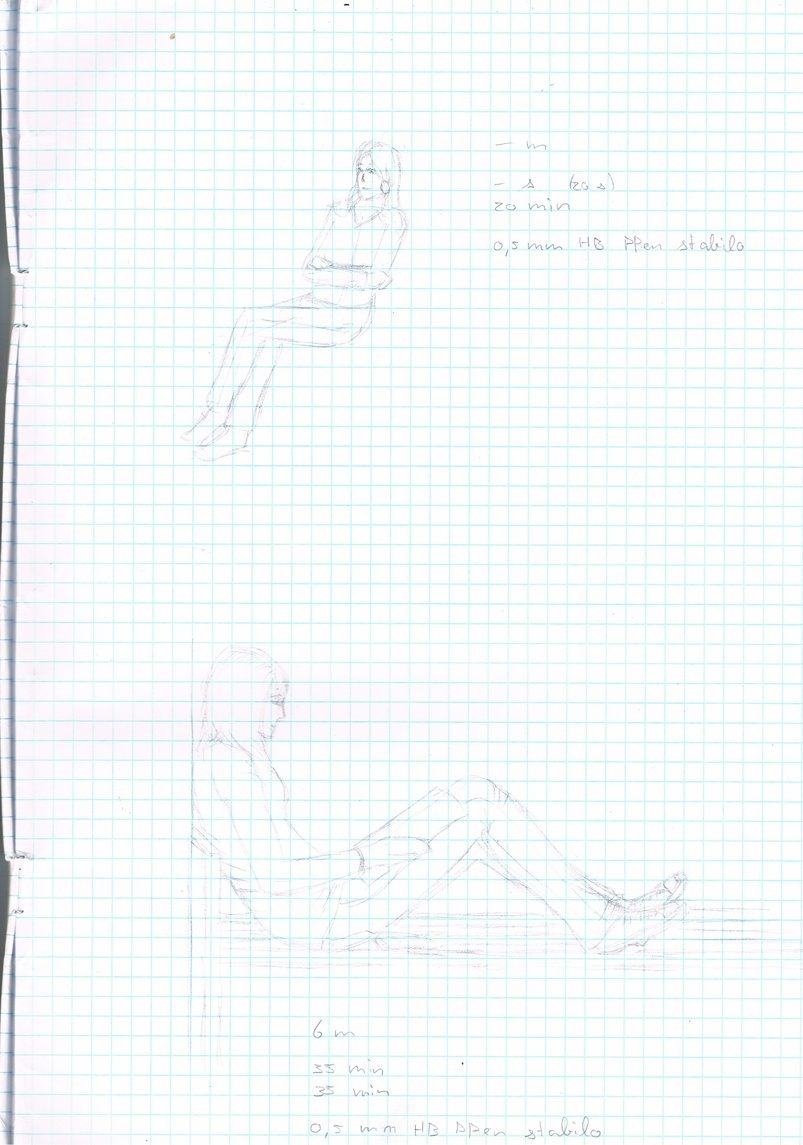
page 3
1. lazy girl
time: pose, none, although i did have to take a quick peek at someone for reference. drawing: 20 min
drawing distance: none
2. studying girl no...
time: pose 35 min, drawing same
drawing distance: 6m (18-20 feet or so)

materials
- 0.5mm HB pencil pen
- eraser
- 5mm grid paper


here are the two chibi characters from the first pages again, but this time i did a moderate attempt at erasing the blue 5mm grid and enhancing the contrast.
Image
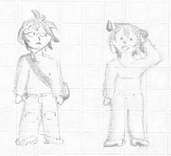
thinking about using this for an ava here, although i like my 'economic stimulus package' one a lot too.

i should go and do the three complete pages like that too tomorrow, but currently i don't have too much time.


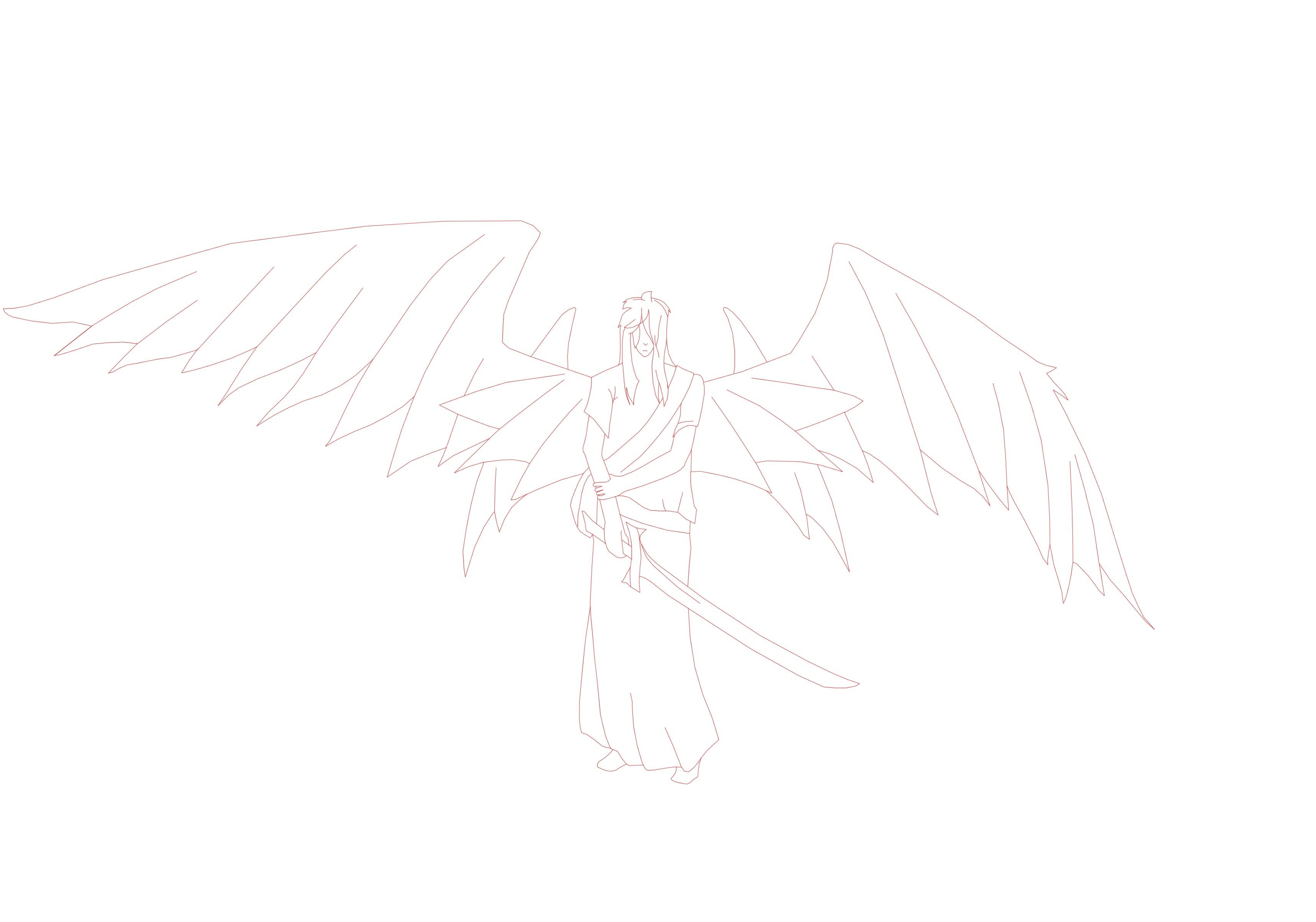
Due to the wipe-out that fileden committed against my online archives, all my art had been down. i managed to re-upload 20 of the best images, but this is not all. due to this not all links will work any more.
here's a list of the re-uploaded files:

http://www.fileden.com/files/2009/1/1/2 ... etches.jpg
http://www.fileden.com/files/2009/1/1/2248324/beast.jpg
http://www.fileden.com/files/2009/1/1/2 ... ic%201.jpg
http://www.fileden.com/files/2009/1/1/2 ... ic%202.jpg
http://www.fileden.com/files/2009/1/1/2 ... ic%203.jpg
http://www.fileden.com/files/2009/1/1/2 ... ic%204.jpg
http://www.fileden.com/files/2009/1/1/2 ... RT_sig.jpg
http://www.fileden.com/files/2009/1/1/2 ... 0angel.jpg
http://www.fileden.com/files/2009/1/1/2 ... INVERT.jpg
http://www.fileden.com/files/2009/1/1/2 ... ragons.jpg
http://www.fileden.com/files/2009/1/1/2 ... Missed.png
http://www.fileden.com/files/2009/1/1/2248324/Eye.jpg
http://www.fileden.com/files/2009/1/1/2 ... is%201.jpg
http://www.fileden.com/files/2009/1/1/2 ... 0front.jpg
http://www.fileden.com/files/2009/1/1/2 ... esnake.png
http://www.fileden.com/files/2009/1/1/2 ... please.png
http://www.fileden.com/files/2009/1/1/2 ... attle2.png
http://www.fileden.com/files/2009/1/1/2248324/Meow.png
http://www.fileden.com/files/2009/1/1/2 ... %20hot.jpg
http://www.fileden.com/files/2009/1/1/2 ... torial.jpg
Image
.

IT IS ALL SO CLEAR NOW

Don't make me slap you on the back of the head.

User avatar
emmy
Violent. Hateful. Fluffy.
Posts: 4068
Joined: Fri Apr 10, 2009 2:34 pm
Location: Comfortably on two special pillows~

Re: oh noes! not another art thread!

#2 Post by emmy »

Some studies
The top drawing is a self portrait of my eye, the bottom one was an attempt at drawing an anatomically correct face... I failed. T.T i can't draw good faces really. damn annoying. does anyone have any tips?

(forgot to write down details this time...)

Phoenix
hmmm... i think i did this one pretty neatly. however, scanner and servimg [censored] up... servimg somehow converted my .png to .jpg, and the lines are barely visible because of the scanner... i should ink this.\

some wings study


oh, i've found some old stuff non my PC... before i had the scanner i used a simple digital camera... poor quality.
a general in armor.

a water dragon.
OMG i cut off his tail... >.<

lineart
it's the same lineart as from my desktop, but red on white instead of white on black, and unresized. i wanted to upload the original scan, but it's worthless... it's the reason why i did it anyway. i did a poor job on those digital lines though. note to self - get a friggin tablet ASAP.
Image
.

IT IS ALL SO CLEAR NOW

Don't make me slap you on the back of the head.

Silver Seren
Templar Inner Circle
Posts: 4029
Joined: Mon Dec 29, 2008 2:40 am
Location: Texas
Contact:

Re: oh noes! not another art thread!

#3 Post by Silver Seren »

I can defeat you in my abilities of drawing canines, but not in much else...if anything.

...you're good...

User avatar
emmy
Violent. Hateful. Fluffy.
Posts: 4068
Joined: Fri Apr 10, 2009 2:34 pm
Location: Comfortably on two special pillows~

Re: oh noes! not another art thread!

#4 Post by emmy »

dang! i swear i already replied to this, and i wasn't drunk! stupid board reset. >.<

anyway... here we go again.

well, i'm only drawing anthro art since a short time ago... a month or so. :grin:

the birds and dragons are kinda my speciality, done lots of them, especially my dragons theme has had a lot of redo. it was really hard to get the phoenix symmetrical. i kept missing one feather in the wing.

anyway, i still have the feeling that something is not quite right with my human faces... dang, i haven't been practicing drawing models enough for the last five or four years. stupid school.

i should get my old art photographed and uploaded some time.
Image
.

IT IS ALL SO CLEAR NOW

Don't make me slap you on the back of the head.

User avatar
supervanman64
Too Curious For His Own Good
Posts: 6432
Joined: Tue Apr 07, 2009 8:28 pm
Location: Indiana X3
Contact:

Re: oh noes! not another art thread!

#5 Post by supervanman64 »

Dude, I love how you draw wings! I can never get them to look realistic. Do you have any pointers for another artist?

Dlemon
Grand Templar
Posts: 1142
Joined: Sat Dec 20, 2008 2:36 pm
Location: Lost in the Internet....

Re: oh noes! not another art thread!

#6 Post by Dlemon »

Your drawing skills are epic. I like everything you've put up so far, and want to see more, you're really good. I wish I had the patiance to get close to good at art, but alas it isn't ment to be. I must fighure out a way to abosrb one's talent.
Image

User avatar
emmy
Violent. Hateful. Fluffy.
Posts: 4068
Joined: Fri Apr 10, 2009 2:34 pm
Location: Comfortably on two special pillows~

Re: oh noes! not another art thread!

#7 Post by emmy »

Well SVM, it's a lot of practice of course, and i often use photographs and anatomic drawings by the profs to get the general idea right. With the (individual) feathers you have to look at the aerodynamics.
anyway, as a fellow artist i understand that just words like that don't help, so i'll give you something with images ASAP. Maybe tomorrow, but i got a huge 3 hour English text exam tomorrow, so i might not feel like it. Luckily i have made all practice exams of English within 2 hours and with only 2 or 3 mistakes so far, so... :D

Dlemon, it does not take practice, it takes boredom. I usually draw a lot when i'm at school during an empty hour or when having to do homework. Procrastinating FTW.


Had a busy evening tonight... I decided to go through all my really old stuff today. That feels... weird. I also found out i lost all my model drawings and charcoal drawings, which is a dang shame... i considered them the best.

I photographed a ceramic piece of mine from back then, i still think it looks good.

ceramic photo #1
ceramic photo #2
ceramic photo #3
ceramic photo #4

I think that one is from... 4, 5 years ago? :|
The thing is quite big, and very heavy. Even though it has more holes, nooks and crannies than a friggin sponge it's massive... I think it weighs 2 or 3 Kg. it's made of coarse clay with some bigger grains which is why it isn't very smooth, it has been glazed (is that how you describe the technique in English?) with several oxides which causes the colors and gleam.


Been drawing something too this evening besides putting stuff on photo and posting this. :o I photographed them too, i'll try to get a decent scan up when the scanner is available again. (my dad hates it when i use his stuff - even though i know better how it works than him) I did about 3 hours over this. Used my trustworthy 0.5mm pencilpen and some cheap one-in-a-dozen 0.5mm inking pen.

two inked drawings
this is the two drawings together... actually inked it this time.

when you see it in bigger detail you can see i'm not that experienced in inking stuff...

Germanic Eagle And Rattlesnake
i'm not entirely happy with the snake head, but hey, it's just a first try. The eagle has been inspired by the Germanic eagle emblem of the Germanic SS. i think that kind of heraldic stylized images look coold
(The Germanic SS was an dependency of the usual SS of the nazi reich in Norway, the Netherlands and Flanders (North-Northwestern part of Belgium and the Northwestern coast of France up to about Duinkerken) )

Eagle Missed
The eagle tried to catch a fish, but alas... He missed and now he's hungry. Tried to practice wings in more poses than just stretched, folded or something in between. Also practiced a bit with setting up backgrounds quickly with just lines.

some old stuff - Girl In Front Of Me
This could be half a year old or even older... Made during one of those boring empty hours at school. We were sitting on a bench together, she against one end and i against the other, just chattering, attempting to learn a bit, (failed of course) being bored. In the meanwhile i also made this drawing. Couldn't have lasted any longer than 50 minutes.

some less old stuff - Face Study
Did this two days ago, practicing face anatomy. Not sure yet whether it is a guy or gal. Attempt... Failed. :(


Geez i talk [censored]. Enough quasi-professional artyfarty talk for now. see, look and enjoy!
Image
.

IT IS ALL SO CLEAR NOW

Don't make me slap you on the back of the head.

Dlemon
Grand Templar
Posts: 1142
Joined: Sat Dec 20, 2008 2:36 pm
Location: Lost in the Internet....

Re: oh noes! not another art thread!

#8 Post by Dlemon »

[quote="emmy"]Dlemon, it does not take practice, it takes boredom. I usually draw a lot when i'm at school during an empty hour or when having to do homework. Procrastinating FTW.quote]
I don't have time at school, and I'm never bored at home! D:
I know what you're saying, but I don't really have spare time to do much. Since it's summer, I don't have much schoolwork to do, so I'll have much more spare time to be bored and have the opprotunity to practice some drawing, and descover a way abosrb one's talent. Then I'll have no need to practice in my spare time! :twisted:

I like the eagles in your most resent update, your inking's great, aswell as the way you draw water.
Image

User avatar
emmy
Violent. Hateful. Fluffy.
Posts: 4068
Joined: Fri Apr 10, 2009 2:34 pm
Location: Comfortably on two special pillows~

Re: oh noes! not another art thread! - update 3 at 27 May

#9 Post by emmy »

As promised! my little explanation of wings. The English text final went really well, so i'm happy... managed to slam the allotted 2 and a half hour into one hour and 15 minutes... :D

it always helps in this kind of things to just go and look up an anatomical image made by profs or a photo with anatomic markings and pointers. like this one from the Berkeley University site.


Image

well, i'll do it step by step, i tried to make the wings in the steps as much identical as possible for convenience, but hey i'm not a robot, so it ain't perfect.


1. You first draw the front lines - the edges that encounter the air first in flight. they define a large portion of the dynamics and pose of the wing. remember, the arm of the wing is NOT straight but a gentle arc with a slightly more defined angle at the elbow... the arm bone itself is positioned further to the rear so you don't see the straight lines of the bone.
when you have the front line done you start in the wrist joint (Pollex) and draw the line which goes to the rear. although it's not actually there as bone nor (explicitly) visible in the feathers it is necessary you draw it. next you draw the first end line of feathers from the body to the elbow, that defines the primary base feather patch. from a point on that line you draw the second endline towards the point of the line which goes to the rear of the wing, and a third endline from there to the wingtip. It is especially that line which differs a lot between bird species.

2. Now you define the feathers. you draw the frontline of the feathers, the edge which encounters the air first since that's the most visible edge in real life too. the distance between the lines depends on how 'fingered' the wings are, that means, how big and deep the cut-ins between each feather. (see A) bigger + deeper = more distance, bigger and broader feathers.

3. You now draw the tips and other edges of the feathers, see B, C and alternate way E. the choice between C and E may depend on how you want the curve and what draws easiest and smoothest. i find myself alternating sometimes.

4. This is an alternate wing, but with the same baselines and endlines. all i did was changing the shape of the feathers, making them less pointy, adding an extra patch of feathers and it suddenly looks like a completely different bird. (that extra patch is always there, you just can't always see it very well, for an example, it's nearly invisible on a crow. but it's there.) not the whole wing needs to have the feathers defined, a little bit open space is good sometimes, don't make it too full. besides, details = TIME. :shock:
I added the little patterns because... well, because i liked it. :)


I. This is a different kind of wing, the kind of wing that carries big birds of prey like the snake eagle. (Circeatus) They are rather big, broad and not at all sleek. They don't call these birds 'Flying Doors' for nothing in the Netherlands, apart from the fact that they're just that big. you start out the same again, front lines, the line from the elbow, the first two endlines, except just a little bit broader. the third endline you don't draw, but instead of that you already define the 'hand', the feather lines on the wing tip.

II. You now draw the third endline and start defining the rest of the feathers. i also already added the secondary patch of feathers too at this stage.

III. the tips and other edges of the feathers. you see that this wing has both sharp and stump feathers, sharper feathers at the 'hands' and more blunt and denser feathers on the base of the wing, the part that carries most of the bird's weight in the air. I also already drew the pens of the fingers.

IV. woo! details! i decided on some dark tips on the wingtip feathers and some darker bands on the feathers of the primary and secondary patch. I also added pens on the primary feather patch. these are the things which add texture to the wings, but it's just like alcohol: too much can kill. see D for some more detail. the pens should not be as pronounced and heavily drawn as the feather edges, on a real bird they're just barely visible too while the edges are very clear sometimes.


...

now would those with burning eyes from all the text please stand up? :shock: 8)
Image
.

IT IS ALL SO CLEAR NOW

Don't make me slap you on the back of the head.

User avatar
RatherInconsiderateFellow
Templar Master
Posts: 436
Joined: Thu Mar 06, 2008 2:41 am
Location: Canada! West Coast!

Re: oh noes! not another art thread! - update 3 at 27 May

#10 Post by RatherInconsiderateFellow »

Huzzah! Someone else figured out birds have elbows!

Seriously though, I'm happy that you have mastered the art of feathered wings and are willing to share your expertise with others.

Paraphrased For Truth; in drawing bird wings it is important to draw two (or three, depends on the bird) layers of feathers. The ones on top and closest to the leading edge of the wing are kinda short and fluffy (fluffiness depends on the type of bird), with the layers underneath being longer and sleeker (sleekness also dependent on bird species). Also elbows. They are very important.
Join the dark side. We have cookies. And free Wifi.
Image

User avatar
emmy
Violent. Hateful. Fluffy.
Posts: 4068
Joined: Fri Apr 10, 2009 2:34 pm
Location: Comfortably on two special pillows~

Re: oh noes! not another art thread! - wings 'Tutorial' 28 May

#11 Post by emmy »

well, as i promised i would scan the photographed images again, so here they are... don't got much news to tell about it. :|

Germanic Eagle and Rattlesnake

Eagle missed

and some new stuff, inspired by a possible new job at a cats hotel:

A Cat's dream
just trying to draw a sleeping cat... ZZzzzzpurrrrr...

Meow!
d'aww... cute kitty! i really like how this one came out.

which one of the two kitties should i use as a new ava? hmmmm...
Image
.

IT IS ALL SO CLEAR NOW

Don't make me slap you on the back of the head.

User avatar
supervanman64
Too Curious For His Own Good
Posts: 6432
Joined: Tue Apr 07, 2009 8:28 pm
Location: Indiana X3
Contact:

Re: oh noes! not another art thread! - update 3 at 27 May

#12 Post by supervanman64 »

RatherInconsiderateFellow wrote:Huzzah! Someone else figured out birds have elbows!

Seriously though, I'm happy that you have mastered the art of feathered wings and are willing to share your expertise with others.

Paraphrased For Truth; in drawing bird wings it is important to draw two (or three, depends on the bird) layers of feathers. The ones on top and closest to the leading edge of the wing are kinda short and fluffy (fluffiness depends on the type of bird), with the layers underneath being longer and sleeker (sleekness also dependent on bird species). Also elbows. They are very important.
Cool. Now that I know that, I'll try to practice drawing wings now.

User avatar
Karcharoth
Templar GrandMaster
Posts: 664
Joined: Sun Mar 22, 2009 9:15 pm
Location: Europe, PL, Cracow

Re: oh noes! not another art thread! - Cute Kitties at 30 May

#13 Post by Karcharoth »

I like the 'Meow' one. Surely with some work it will look perfect.
Place for Your advert!

User avatar
emmy
Violent. Hateful. Fluffy.
Posts: 4068
Joined: Fri Apr 10, 2009 2:34 pm
Location: Comfortably on two special pillows~

Re: oh noes! not another art thread! - Cute Kitties at 30 May

#14 Post by emmy »

you mean, digital work? but i don't have a tblet... T.T (yet)
Image
.

IT IS ALL SO CLEAR NOW

Don't make me slap you on the back of the head.

User avatar
Karcharoth
Templar GrandMaster
Posts: 664
Joined: Sun Mar 22, 2009 9:15 pm
Location: Europe, PL, Cracow

Re: oh noes! not another art thread! - Cute Kitties at 30 May

#15 Post by Karcharoth »

No, I don't mean tablet. It's vital to have a good drawing skills before buying tablet.

Just a lil more practice and You are on Your way.
Place for Your advert!

Post Reply